Day 28: The best seat selection UI ever
Airline website developers could learn a lot from the Eurostar seat selection interface.

I am planning my travel to Bitcoin Unleashed London next month today. I already had my return flight to Hong Kong booked from Frankfurt, so I thought I'd take the train back to FRA instead of yet another flight. This would also give me a chance to try out the Eurostar train...the international train service that goes under the English channel...and check off another bucket list item. I'd also get to spend a night in Brussels, a city in a country I've not yet visited.
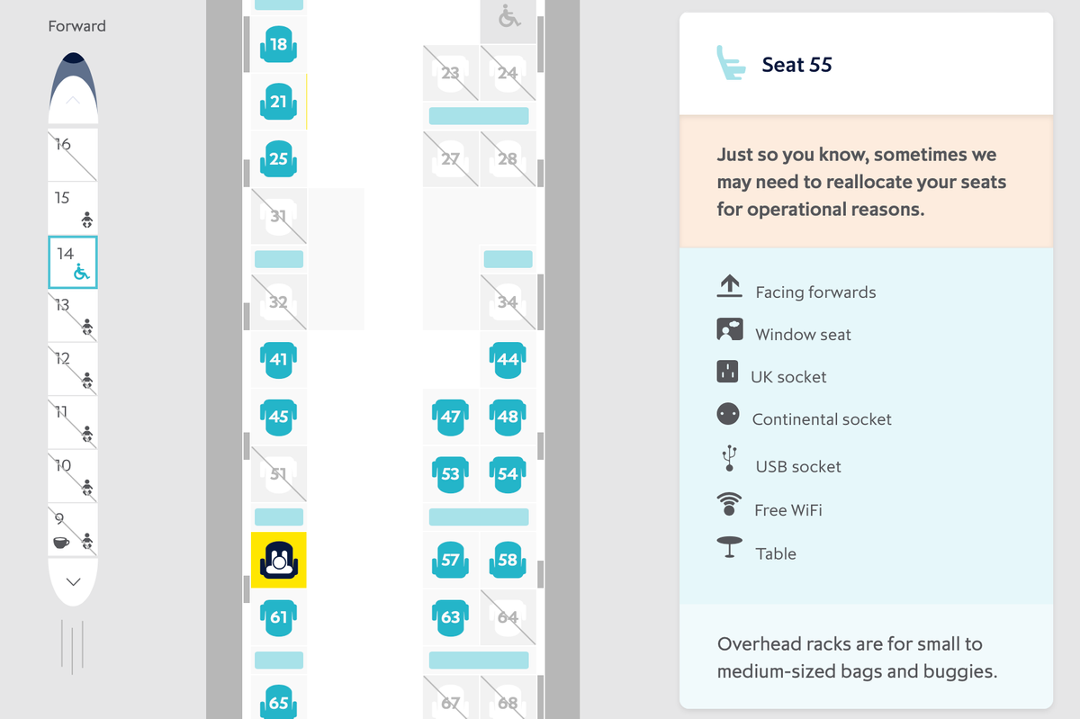
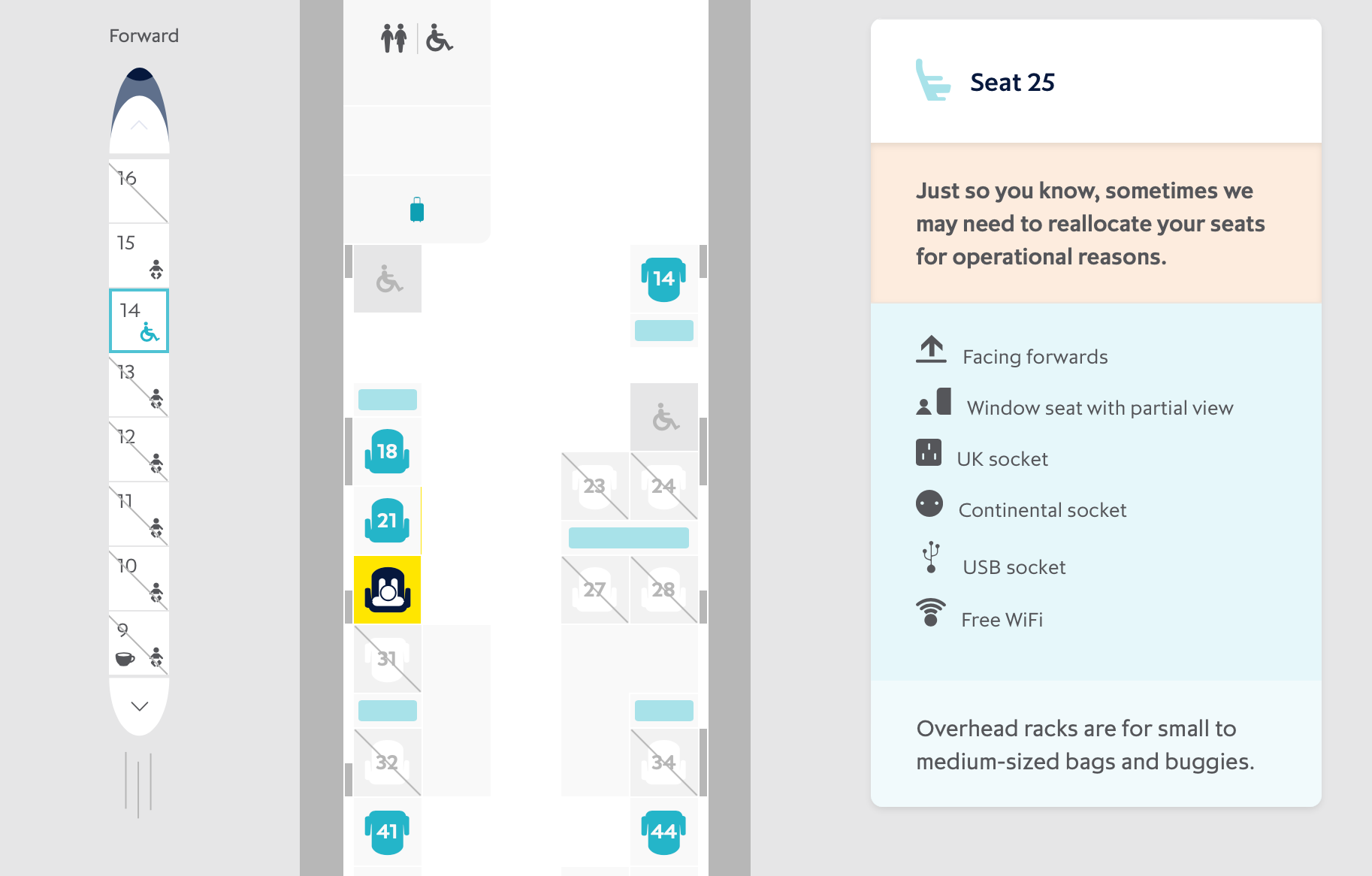
While the entire checkout flow for buying a Eurostar ticket was very good...much better than your typical airline purchase flow, I was particularly impressed by the seat selection user interface. It very clearly shows you what type of seat you're choosing and various features someone might care about when making the selection.
Some people choose a window seat because they want a wall to lean against. Other people choose one because they want to watch the scenery go by. The Eurostar seat selector clearly shows the difference between these different types of window seats.

I also like that they clearly indication the direction the train is going and whether your seat will face forward or backwards. I'm not particularly sensitive to which way I'm facing, but I know some people that feel very uncomfortable facing the wrong way. It's very common when buying train tickets to not be able to tell which direction the seat you choose is facing relative to the direction of travel of the train.
Airline seat selection interface designers (is this a career path or job title?) would do well to study this interface and apply it to their airline's check out processes!
